Logo & Brand
Design System
Brand guidelines
AirBadge communications should look corporate, clean, and crisp. Variations on a corporate blue convey a feeling of confidence and trustworthiness. Simple and well-organized forms evoke a sense of simplicity and uncluttered processes.
AirBadge uses imagery involving clients using mobile devices, clean and serene office spaces, and monoline illustrations to depict abstract concepts.
Aim for a bold and authoritative feel in typography and imagery. Avoid flourishes and organic shapes. There is an emphasis on icon-style illustration, sharp contrast, and simplified forms. People interacting with our content and services should feel ease and confidence.
Also be sure of your spelling: it’s AirBadge, not Airbadge or Air badge.
The AirBadge zephyr
Evoking a gentle breeze, a windsock, or the fluid lines of one or more airplanes, the flowing strokes of the AirBadge zephyr point towards the efficiency and smoothness of automated solutions and forward progress in the airport badge office.
The zephyr is not a proper noun and is not capitalized.
The zephyr can be used in conjunction with the company name or alone as a watermark or graphic element. It should appear in the blue gradient or reversed on white. It can appear in a subtle hint, shown in partial, or stand on its own as a divider. The tails of the zephryr should always point skyward and this upward motion should be the visible element when it is shown in partial. It should not be rotated, flipped, or ornamented.

Color palettes – website
#05003b
#003852
#035c86
#d4dbe2
#ededed
#0e0f22
#3f3f3f
#9e9e9e
#c6c6c6
#ededed
UI Color palettes
UI palette based on shades and tints of #035c86
#CCDEE6
#6b0000
#9b0000 – error color
#f6d2c6
#4dbd74 – green light
| Copy / Paste Color Table | Hex Code | |
|---|---|---|
| Dark Blue | 05003b | |
| Dark Teal | 003852 | |
| AirBadge Brand Blue | 035c86 | |
| Light Blue | d4dbe2 | |
| Very Light Gray | ededed | |
| Dark Gray | 0e0f22 | |
| Medium Dark Gray | 3f3f3f | |
| Light Gray | 9e9e9e | |
| Medium Light Gray | c6c6c6 |
Typography
Montserrat Light
Aa
Montserrat Bold
Aa
Montserrat Black / Ultra Bold
Aa
Body Text: Open Sans
Aa
Display / Headline Text
Heading Level 1
Heading Level 2
Heading Level 3
Heading Level 4
Heading Level 5
Heading Level 6
Functional Text
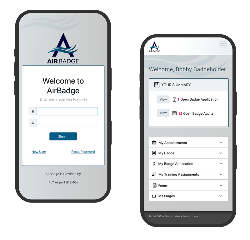
Automate your badge office with AirBadge: A next-generation IdMS.
Body Text
AirBadge is a comprehensive platform created exclusively for airport credentialing. Become a paperless badge office. Track renewals, eliminate manual data entry, and put notifications and your TSA mandated badge audits on autopilot. Enhance every aspect of your credentialing operations using AirBadge.
Font present in the AirBadge Logo: Mr Eaves Mod OT in weights regular and heavy: available through Adobe.
Buttons & forms
Call to Action / light button is shown on dark background.
Imagery
Zephyr in original blue gradient

Zephyr in inverted colors and gradient

Zephyr in solid white 50% opacity

Zephyr in solid white 70% opacity
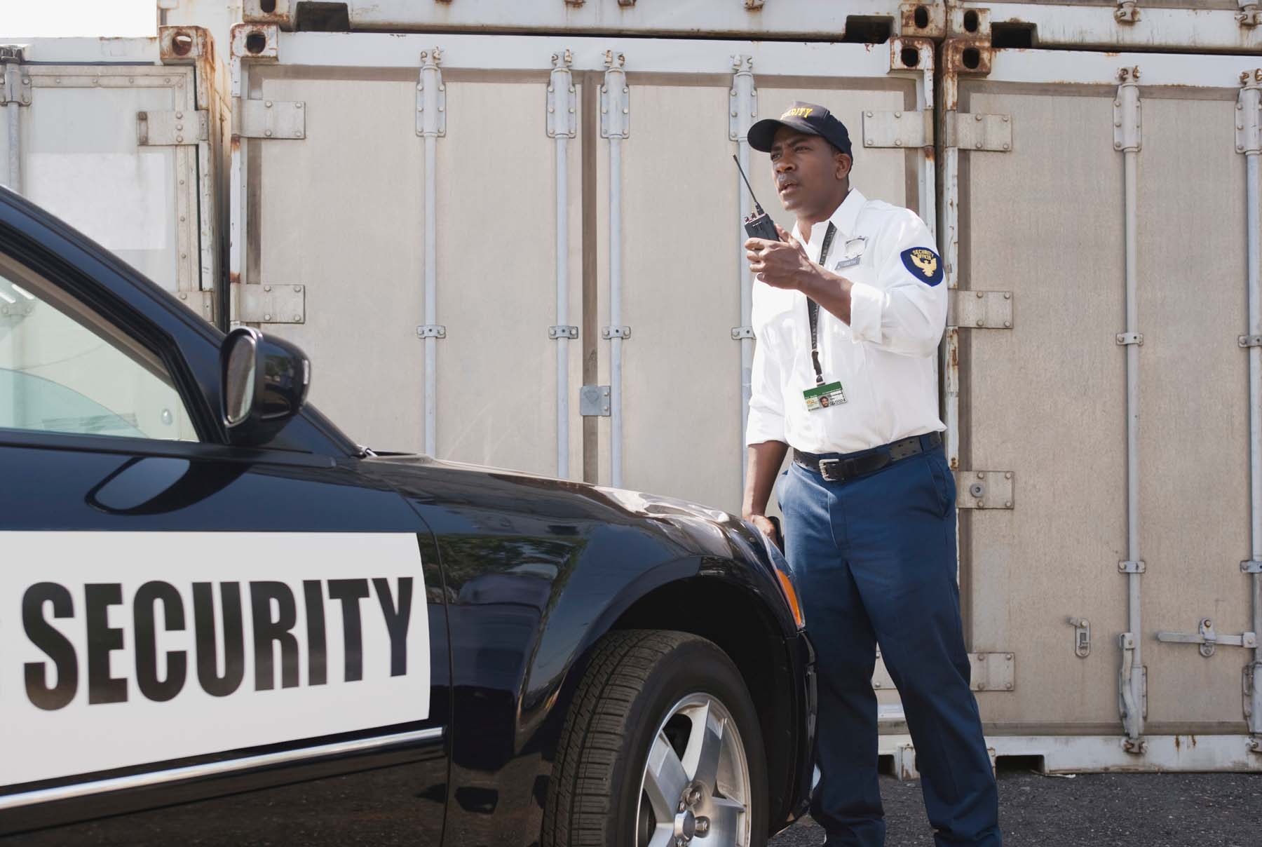
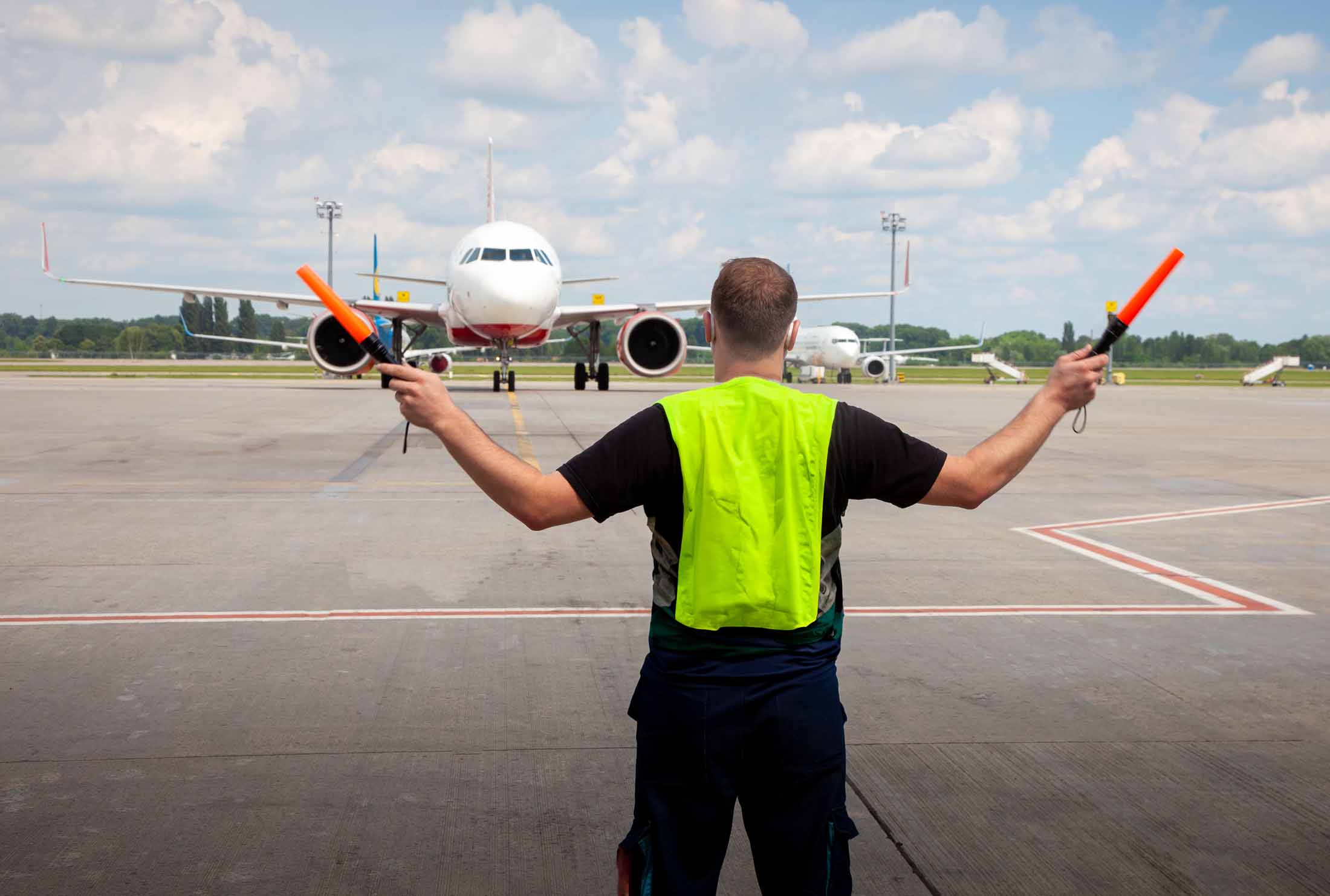
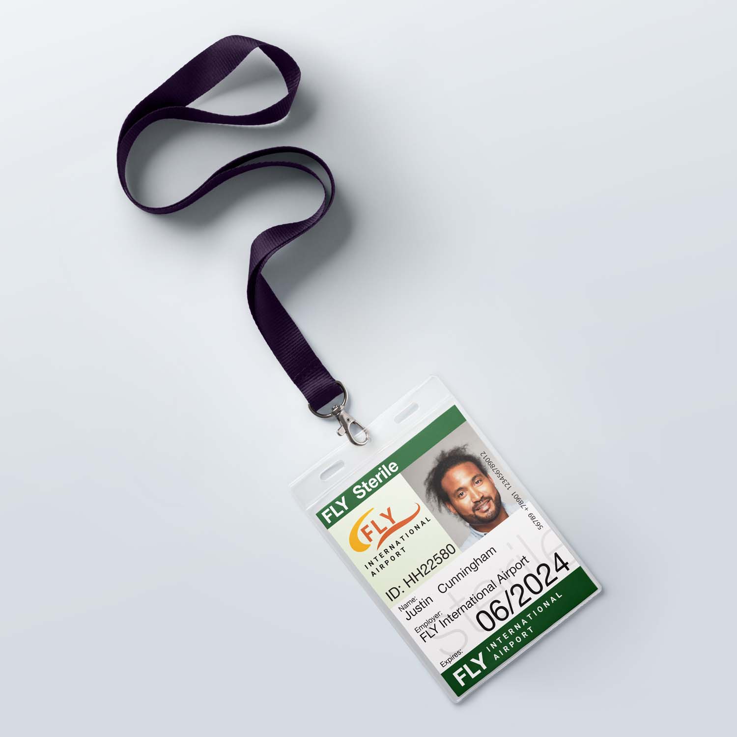
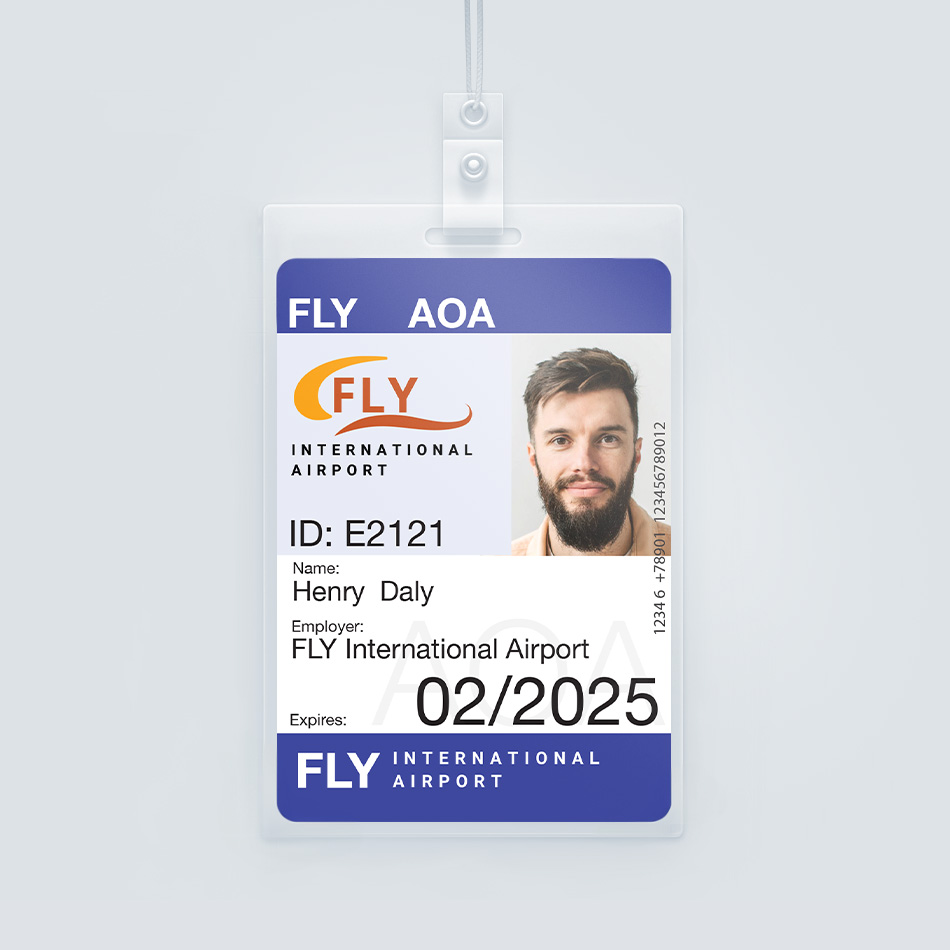
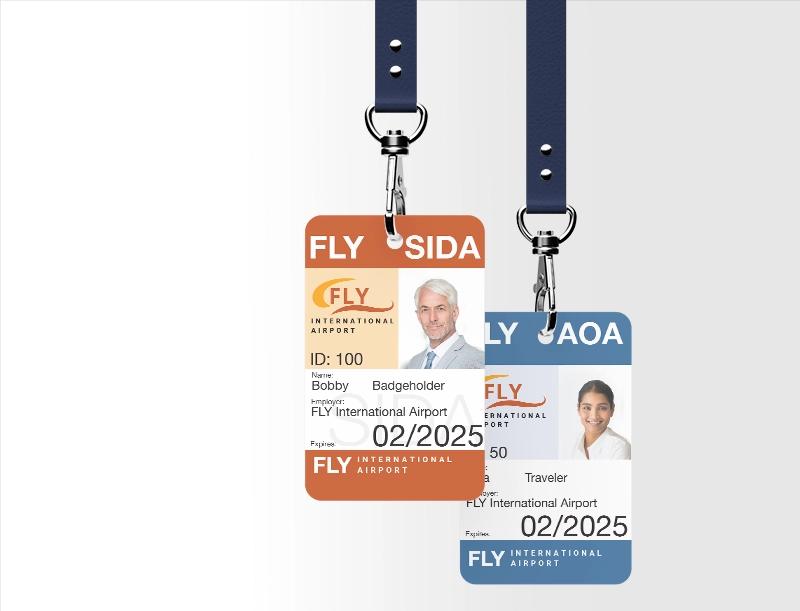
Airport Imagery


AirBadge written communications

AirBadge communications are friendly, approachable, clear, and concise.
We adhere to the writing conventions of the Microsoft style guide.
| Term | Usage |
|---|---|
| click | Use to describe selecting an item with the mouse by clicking the mouse once. Don’t use click on. |
| click in | Use only to refer to clicking in a general area within a page, window, or other UI location. |
| double-click | Use to describe selecting an item by clicking the mouse twice in rapid succession. Hyphenate. Don’t use double-click on. |
| drag | Use to describe holding down a button while moving the mouse, and then releasing the button. Don’t use click and drag or drag and drop. It’s OK to use drop by itself if drag isn’t precise enough. |
| hover over, point to | To describe moving the mouse pointer over an area of the UI without selecting it, use hover over or point to, as appropriate for your audience. Use hover or hovering as the adjective and noun form. Examples In Microsoft Edge, when you hover over a link, the URL appears in the lower-left corner. The hover image is displayed when the user points to the button. To program the pop-up action that’s triggered by hovering …. Pop-up windows that appear on hover Don’t use mouse over or move the mouse pointer to. It’s OK to use move the mouse pointer to in content that teaches beginning skills. |
| press and hold | Use only in content that teaches beginning skills. |
| right-click | Use to describe clicking an item by using the secondary mouse button (the right button by default, but the user can customize this). |
| scroll | Use only in content that teaches beginning skills. In other content, use a phrase such as move through. |